Để canh giữa 2 khối div theo chiều dọc thì ta có nhiều cách làm ví dụ như sử dụng margin auto, table cell tuy nhiên những cách đó đã lâu và không phù hợp với công nghệ Flex mới bây giờ.
Ở bài học này mình sẽ hướng dẫn bạn căn giữa 2 khối div theo chiều dọc nhanh chóng.
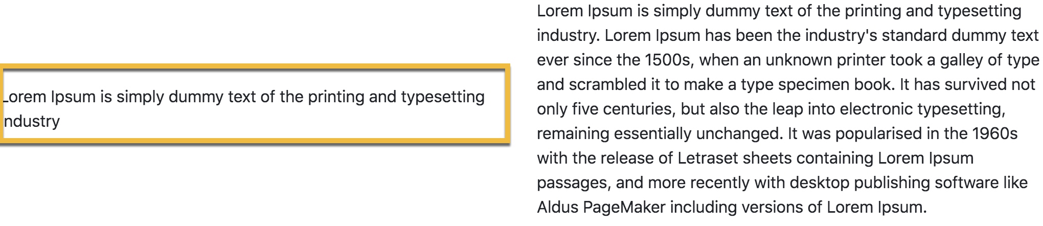
Bootstrap 4 đã hỗ trợ class align-self-center, nó sử dụng Flex để giúp canh giữa tốt hơn. Mình sẽ đặt nó trong DIV cần được canh giữa, hay nói cách khác là DIV nào có chiều cao thấp thì ta gắn class vào!
<div class="row">
   <div class="col-6 align-self-center">
      Lorem Ipsum is simply dummy text of the printing and typesetting industry
   </div>
   <div class="col-6">
    Lorem Ipsum is simply dummy text of the printing and typesetting industry. Lorem Ipsum has been the industry's standard dummy text ever since the 1500s, when an unknown printer took a galley of type and scrambled it to make a type specimen book. It has survived not only five centuries, but also the leap into electronic typesetting, remaining essentially unchanged. It was popularised in the 1960s with the release of Letraset sheets containing Lorem Ipsum passages, and more recently with desktop publishing software like Aldus PageMaker including versions of Lorem Ipsum.
   </div>
</div>
Cám ơn bạn đã đọc bài viết.
